Website redesign, and visual identity refresh to better reflect the clinic's values and services

I started this project for the PSW Acupuncture Clinic because coming from a healthcare background, I understand the importance of smooth user experiences in health-related platforms, and I was excited to apply my design skills to improve the clinic's online presence and service delivery. The clinic's outdated website was making it difficult to attract new clients, so my goal was to modernize and improve its functionality.
I redesigned the PSW website, focusing on improving usability, and updating content. I also worked on a full rebranding and visual identity refresh to create a cohesive and professional look that better reflected the clinic's values and services.
Project was fixed to 6-week timeframe
An outdated website is preventing the business from effectively attracting and engaging potential customers. Improving the online presence is essential to increase visibility and grow the client base.
My goal was to improve the usability of the website and promote client satisfaction.
Without any CTA buttons or description, business is missing an opportunity to effectively engage users and communicate the value of the business.

The homepage appears disorganized with excess information that could be consolidated or relocated to a different page to prevent user overload.

Poor text contrast makes it difficult for users to read the text and lead to frustration and disengagement. Additionally, "Schedule Visit Today" is available on Acupuncture page but the button does not work.


New insight from user research
Participants often visit home page to get an overview of the services offered, not an in-depth medical resource. Keeping the home page focused on services helps meet their initial expectations.
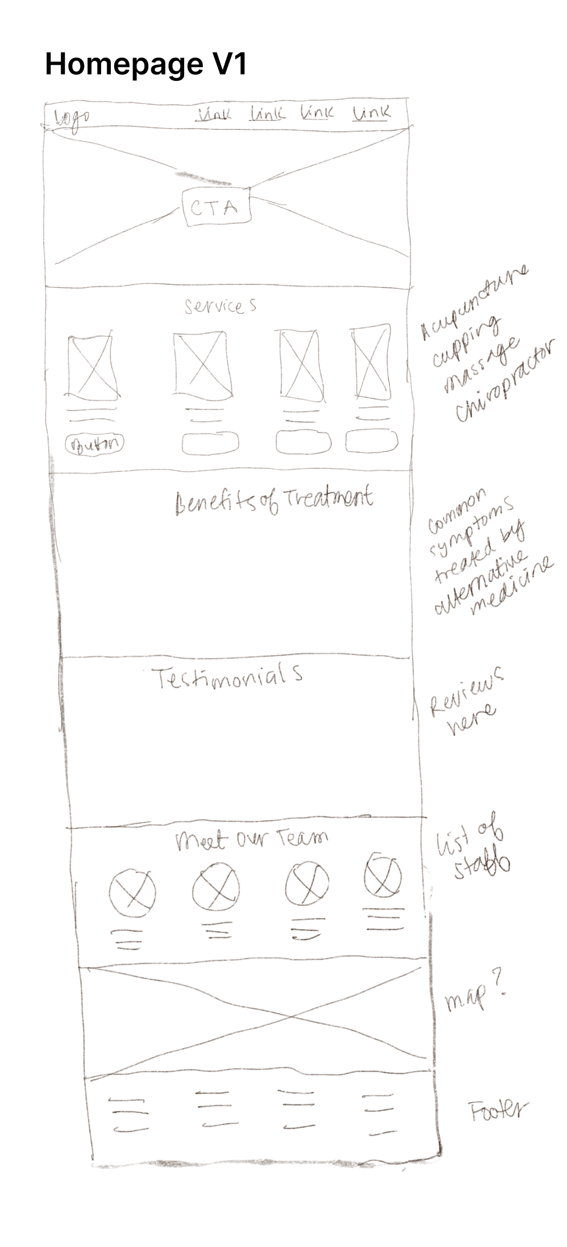
After creating rough sketches, I conducted a card sort to understand how users would expect to find and access information on the site, and which design idea aligns most closely with their mental model. Based on the results of the card sort, I decided to move forward with version 3 of the homepage.


I organized the homepage content by focusing on key touch-points identified in the user research


I replaced the "Read More About" CTA with "Learn More." This change was driven by the context-specific needs of the website, where "Learn More" aligns better with the goal of deeper user interaction with service details. Additionally, market analysis indicates that "Learn More" is a standard practice in similar contexts, reinforcing its effectiveness as a CTA.

Redesigned to provide an overview of services offered, focusing on initial user engagement instea of detailed medical information

The service detail pages were meticulously crafted to offer in-depth information and specific medical symptoms, providing users with comprehensive insights into each service offered


To embody PSW’s expertise and the nurturing essence of their services, I curated a grounded soothing color palette that draws from earthy browns. This selection is complemented by an extended palette that includes sage green and grayscale variations to provide versatility for the product’s interface.

The typography system employs a duo of serif and sans-serif typefaces to balance tradition and modernity. The Roboto Slab typeface, with its traditional and reliable character, is ideal for headlines and calls attention to key brand messages. In contrast, Poppins, known for its clean lines and straightforward form, serves as the perfect choice for body text, ensuring legibility and a contemporary feel throughout the brand's communications.

"PSW" remains from the original design, honoring the founder's initials, while the peach's colors and design have been updated for a refreshed look. The logo's peach leaves, symbolizing longevity and rejuvenation, draw from the culturally significant peach fruit, a symbol of immortality in Chinese culture. This reflects the clinic's dedication to holistic Chinese medicine and wellness.
The versatility of line illustrations allows seamless integration across various design contexts, from print materials to digital platforms and mobile applications, making them a practical and cohesive choice for brand's visual representation.


My next step is to implement an online booking feature, focusing on crafting a seamless user experience. This addition will enable effortless and efficient appointment scheduling, aligning with my goal to streamline interactions and provide maximum convenience for users.