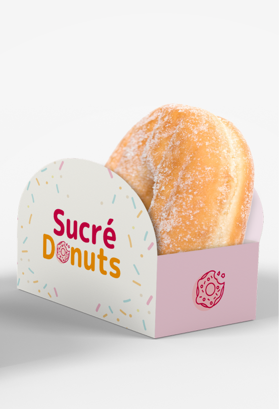


Sucré Donuts is small family owned donut shop. In a delightful fusion of tradition and modernity, the mission of Sucré Donuts is to create a brand symbol that resonates in the hearts of the community. The company is envisioning a visual identity that's not only memorable and easily recognizable but also distinctively stands out amidst the bustling environment of local coffee shops, national fast-food chains, and other bakery establishments.
What began as a passion project to create a logo for a local restaurant evolved into a comprehensive design. My role involved crafting a refreshed visual identity for Sucré Donuts, incorporating a refined color palette, typography, and a simple and friendly logo.


The M+2p is known for its clean, modern look with rounded edges, giving it a friendly and approachable feel. M+2p's round and friendly look is great for attention-grabbing signs and titles, showing off the shop's fun side.
I needed to paired M+2p with another body text font which would maintain balance and harmony in the design. For clear legible body text, I chose the simple and approachable Open Sans, ideal for menus and customer communication. Open Sans perfectly complements the roundness of M+2p without competing for attention. Together, these fonts create a harmonious balance, reflecting the donut shop's warm and inviting atmosphere.


